Creative Director Eric Mongeon has seen MIT Technology Review evolve from a print-focused publication to a multichannel brand.
Amplifying
the Institution’s
Mission
By Kelly McMurray | Photograph by Jared Leeds
Eric Mongeon has seen MIT Technology Review magazine through multiple evolutions—first as a contract designer, then as a staff art director (twice), and now in his current role as creative director. As he says, “Third time’s a charm.” At each of those points he has directed the visual expression of one of the leading technology magazines published by one of the preeminent institutions in the world. And his strategic thinking has kept it aligned with the institution’s brand the entire time.
Eric began working on what was then known as Technology Review as a designer at Kelly Design (now 2communiqué) in 1999. Two years prior, the magazine was overhauled by editor John Benditt, who came to the magazine from Science. During his tenure, Benditt took it from a sleepy alumni magazine and re-envisioned it as a commercial publication available on newsstands. It was nominated for an ASME award for Best Overall Magazine in 2000.
Now with a substantial newsstand presence, Technology Review experienced a circulation shift from 90k to 320k. In 2000, the magazine went from being published six times a year to 10, at which point Eric became the full-time, in-house staff art director.


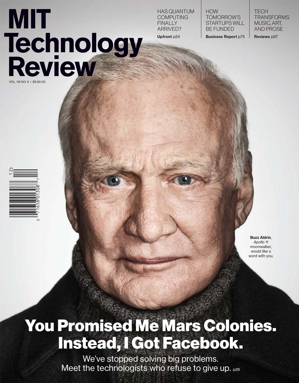
The first generation of TR covers were experiments in economy: one big cover line boldly typeset with a single icon or an emblematic photo to anchor it. This visual minimalism stood out on a noisy, crowded newsstand.


In 2002, Benditt left MIT to open a publishing consultancy. Eric followed suit the next year, opening a design studio in western Massachusetts. But after a decade of working with prestigious higher-ed institutions like Smith College and corporate clients like Microsoft, he was once again recruited by MIT to oversee the design of their publication.
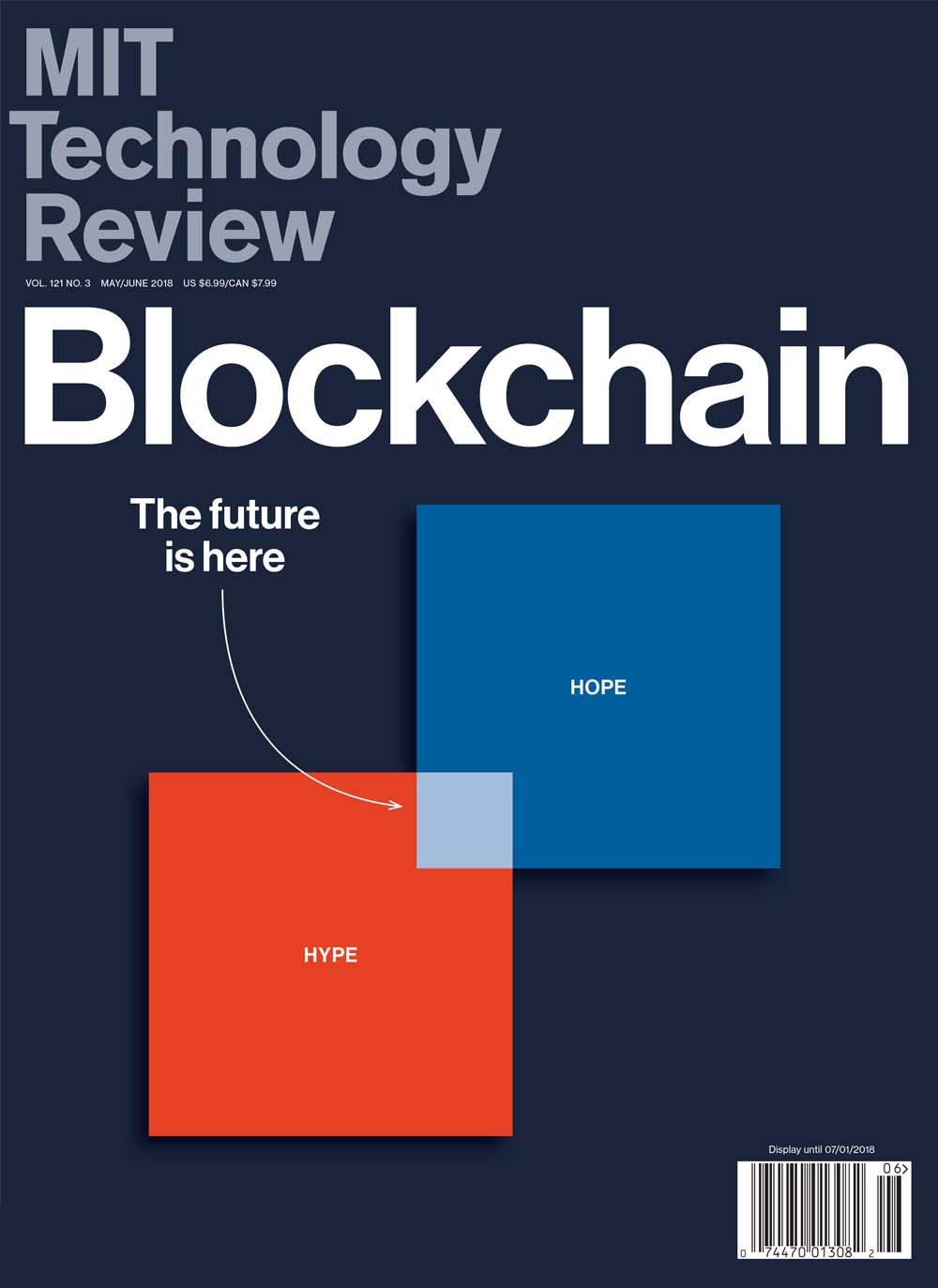
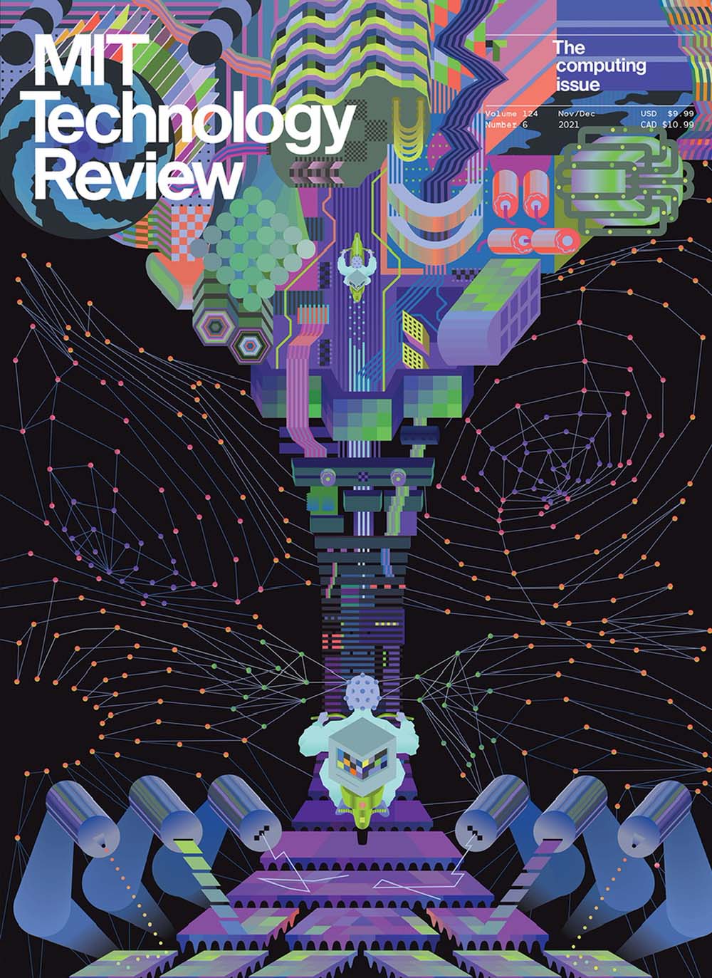
During his second tenure, Eric evolved the design of the magazine and extended the brand into successful event communications. “The look of the magazine—its typography, color palette, and approach to imagery—formed the basis of a graphic identity that eventually extended well beyond the page,” he says. “And while print was no longer central to the company’s business strategy, the magazine remained, and still is, its calling card—sort of a North Star for an evolving media brand. Even today, everything we produce bears a family resemblance that is guided by the design of the magazine.”
But the biggest change Eric made during this time wasn’t visual. He eventually persuaded the publisher to add “MIT” to the magazine’s title, connecting it with the institution and differentiating it from other technology magazines on the newsstand. Since the institution is a leader in technology and innovation, the MIT name gave the magazine the credibility it had been lacking for the previous decade. But, as Eric notes, it can be a double-edged sword.
“The authority and gravitas that the MIT brand brings can also be threatening. ‘I didn’t go to MIT, this can’t be for me.’ ‘Oh, it’s about MIT. I don’t care what’s going on at MIT.’ We had to be very thoughtful and strategic in reassuring people that this [publication] is for everybody. Technology undergirds everyone’s life.”
By that time, the magazine was also attempting to become much more than a print publication; the publisher began experimenting with a digital-first model with content uploaded to the website daily. “It was a very different problem set,” Eric shared. “[Digital first] made better sense in principle than practice.” While the production of the print edition was manageable—partially due to print’s hard stop and the consequences of missing a press deadline—digital publishing’s flexibility required a disciplined approach to deadlines that proved difficult for many editors: “Another hour will make this better, another day.” Things quickly became disorganized, and unfortunately, the print edition suffered.


Disillusioned, he left briefly for a job as creative director of Boston magazine. But following a shakeup among the senior leadership in 2017, MIT Technology Review’s new publisher and editor invited him to resume his old role.


MIT Technology Review’s current model includes a single-topic print magazine published six times a year and a digital track that includes as many as 40 stories published online weekly, each with curated or art-directed imagery. The online track also includes a feature-length story with photography, motion, or infographics published biweekly. Additionally, the company stages five annual events, creates original and custom research reports, publishes MIT’s sister alumni magazine, and produces four popular podcasts.
And everything meets the same brand standard, with MIT at the core of it all. “Three magical letters confer a level of authority to the brand,” Eric notes. “Impossible to earn otherwise.”


“MIT’s mission is promoting scholarship in the area of technology solves international problems. How can technology be a force for good in the world? The Technology Review brand is really an amplifier for the institute. That is why the institute continues to publish the MIT Technology Review brand. It’s a way of taking this core ethos/mission specific to the institute and helping to shape a global conversation about the meaning and value of emerging technologies. There is a compatibility between the mission of the institute and the publishing brand, and what it means is that we need to be very thoughtful about the language. This is for everyone. Technology is a part of your life.”
MIT Technology Review is not your typical institutional publication. “The institute does not regard the magazine as part of the development platform. It really is a mission-based project, which is so rare in publishing. The goal isn’t earnings, though earnings do matter, the mission is the thing that matters. It adds to the global conversation. We’re all better off if we are thinking about these issues.”
Eric also notes that many colleges and universities put themselves in a tough spot, not wanting to offend audiences of opposing positions. He believes that can be remedied by telling stories that are authentic to an institution. “If you understand the mission of the institution and have the support of the institution, you are then able to express that through story choices, design choices, and the authors you work with. If it is all authentic to the institution itself, what if some people get provoked? So what, if it is all aligned with the mission?”
Well said.
Share this article
