make it compelling
The beginning of any digital story worth readers’ attention requires a return to the basics: infrastructure, planning, and effort.
By Laura J. Cole | Illustration by Kaylee Sterns
“No entertainment on earth can match a good story compellingly told.”
Octavia E. Butler wrote this reminder in one of her notebooks—one of the many motivational notes she scribbled to herself in journals, day planners, and repurposed pages of an old wall calendar. In those pages, the mother of Afrofuturism imagined—or manifested, in the nomenclature of today’s youth—a future for herself that went against every obstacle that could have predicted a different one.
For Butler’s 75th birthday, Lynell George wrote a feature-length profile for The New York Times about Butler’s life and achievements that takes readers from the Los Angeles Public Library, which introduced her to some of those stories, through the cotton fields that inspired Kindred, and across the plains of the Red Planet to the landing site for NASA’s Perseverance rover that was named after Butler.
The storytelling—like Butler’s own—is beautifully crafted and compellingly told. In print, an interest in Butler or just plain stunning writing is enough to hold your attention. But what drew me in and kept me captivated—and I imagine so many others—to the last word in the digital version of this 4,000-plus-word profile were the visuals and the pacing. The experience feels cinematic, combining the power of imagination with real images while leveraging scrolling to slow down reading in key places.
Change body copy to serif for more editorial look and feel.
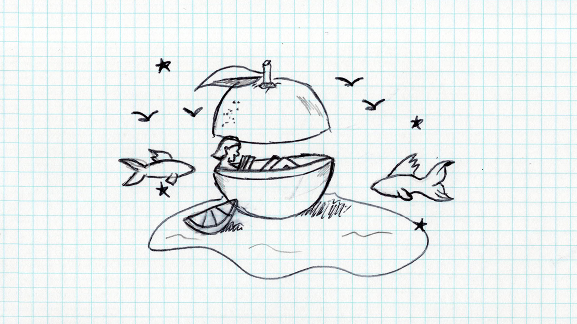
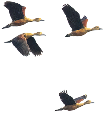
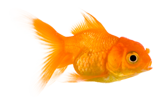
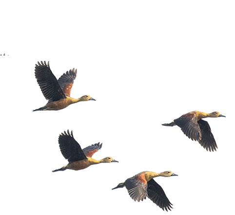
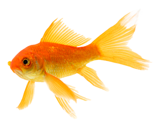
Love the concept. Consider the movement of the birds and fish.
Director, writer, and artist Ainslee Alem Robson converted photos and video footage into what the site calls “3-D point clouds,” which, rather than disrupt the reading experience, enhance it. The presentation was thoughtful and considerate, with an emphasis on not only sharing Butler’s story but drawing you into her worlds.
It’s something that could only be replicated on a website—and it uses that medium to its fullest potential. It’s something the Times does so well. Some other stunning examples include stories on the history of Roe v. Wade, on what scares the most daring Olympians, and on the million Americans who died from Covid.
Make hyperlinks red and open in a new tab.
Admittedly, the Times and other big-name publications have the budget, staff, and motivation to turn stories into experiences, but a recent thread on the CASE Editors listserv got me wondering: Shouldn’t we, as editors, be giving as much thought to making the online experience of our magazines as compelling as our print one? And what does doing so require?
Shouldn’t we, as editors, be giving as much thought to making the online experience of our magazines as compelling as our print one?
Arguably, the pandemic forced many editors to think about it more than ever before, but in my experience—and in talking to other editors—the answer can be boiled down to three things: the right infrastructure, some forethought, and a willingness to put in the effort.
When Rin-rin Yu joined Howard University as editor of its magazine, she knew she wanted to make big changes, including a full redesign of the publication and a new website, especially since they were moving to one issue a year being fully digital. Yu—who gave a keynote presentation on going hybrid at the 2023 CASE Editors Forum—knew changing both print and digital was critical.
“The digital needed changing,” she says. “Before, they would simply cut and paste the articles onto the website and stick a picture in and call it a website. It was not interesting. It was difficult to read. It took away from how good the articles were because it didn’t look good to read.”
Update the pullquote style to reflect the design of the headline..

Yu, like so many others, drew inspiration from the Times.
“We don’t have the budget to re-create that, but we could create a similar template,” Yu says. “I love how they had the call-out statistics on the side, so we have that feature. I knew we needed really large-width photos. The whole screen needs to be filled. I want people to get drawn into the photos. And we added really cool captioning of our images and our videos to help entice visitors.…I can’t expect everyone is going to read every word, but I want them to take something away from it. As they scroll through, they can see the captions, the deck, the headline, and hopefully they’ll be like, ‘Oh, I learned something.’”
The elements are working, except for the birds. Use examples that mirror the shape of the fish.
Yu has since put those features to use, even hiring legendary photojournalist Pete Souza to photograph the university’s outgoing president for a special issue in his honor.
“When I asked Souza, who’s one of my heroes, to do the photography, he said, ‘I don’t do magazines, but I’d like to do this,’” Yu says. “We had the ability, because we built this into the website, to feature beautiful photography. This is what the site was designed for. There was no way in hell we could have ever done that on the old version, because that would’ve just been like a slap in Souza’s face.”
The link style is resolved.
Having the right infrastructure in place opens up worlds of possibilities and allows teams to experiment, but ultimately, both require thinking through a story’s potential before even getting started.
The team behind Harvard Business School’s Alumni Bulletin is currently in the midst of conducting a content survey to think more thoroughly about how to reach their audiences across all platforms, but over the past few years, they’ve gained insight into what a story needs to succeed online.
“Online you have to be more visually interesting,” says Dan Morrell, editor of the Bulletin. “There’s more onus on design and delight online, I would say. There’s also even more of an impetus on writers, and especially alumni magazine writers, to hook and propel, meaning, listen, you have even less time to get people, to get them to bookmark, or get them to keep the page open, or what have you. I think we always knew it was a competitive marketplace for people’s attention, and even more so now.”
Font is working. Look at adding the white box used in the headline.
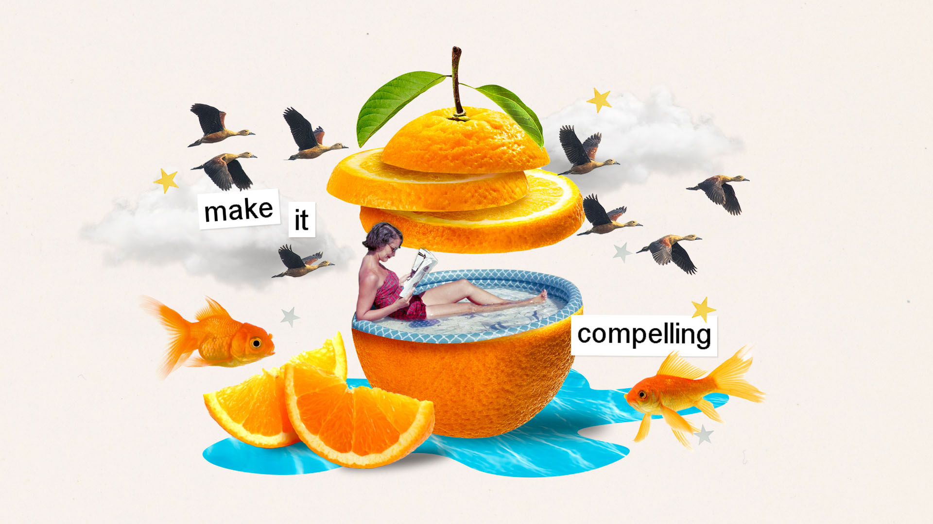
Nice. Love the composition, movement, and integration of the words.
To capture their attention and hold it, you need a good writer and editor, and strong visuals, yes, but also some forethought.
“Our NBA Africa story is a great example because it had the opportunity for visual storytelling,” he says. “We had to ask NBA Africa for specific art assets, and our web team had to condense these GIFs to make the page load more quickly. We had to choose a photographer who had the ability to do video so she could shoot out a couple of questions while she was doing still photos of the main protagonist. We also had to have somebody—me, specifically—who was willing to invest extra time in cutting these things and putting together a project brief about what it would look like.
“We had to think about all that stuff ahead of time. You can’t backfill that. You do have to be thoughtful and strategic at the outset. And that is a muscle that we’ve been building.”
Because ultimately, all of what goes into making a story compelling—whether on the page or the screen—requires time. Time for finding, dreaming, planning, and executing.
There’s the muscle to know what to do, and then the lift of actually doing it. Morrell hinted at what goes on behind the story, and it does take considerably more time, more effort, and, most importantly, a champion.
When I was at UCF, the champion was often a staff writer. For one story about a student who made history as the youngest team captain at the 2019 FIFA Women’s World Cup, then-features writer Jenna Marina Lee spent months working with Konya Plummer, her handlers, the athletics staff, and FIFA. In addition to doing interviews, project-managing, and attending photo and video shoots, she built the relationships that allow a story to deepen. She wrote the feature-length profile but also was involved in providing feedback on the video, the layout of the print and digital story, and even the direction for the photography. As an editor, my job was to keep other projects off her plate, so she had time to focus on getting the story right, and obviously to give guidance and feedback when necessary.
Because ultimately, all of what goes into making a story compelling—whether on the page or the screen—requires time. Time for finding, dreaming, planning, and executing. We may not be creating worlds and envisioning the future like Butler, but hopefully we are creating stories compelling enough to entice readers to spend their time in a tiny part of the world we think is worth visiting.
Share this article


Kaylee Sterns is a graphic designer and collage artist living in Albany, New York. She enjoys pulling from her background in both studio art and graphic design to create playful and nostalgic work, often sourcing vintage imagery from advertisements or greeting cards of the past.


make it compelling
The beginning of any digital story worth readers’ attention requires a return to the basics: infrastructure, planning, and effort.
By Laura J. Cole | Illustration by Kaylee Sterns
“No entertainment on earth can match a good story compellingly told.”
Octavia E. Butler wrote this reminder in one of her notebooks—one of the many motivational notes she scribbled to herself in journals, day planners, and repurposed pages of an old wall calendar. In those pages, the mother of Afrofuturism imagined—or manifested, in the nomenclature of today’s youth—a future for herself that went against every obstacle that could have predicted a different one.
For Butler’s 75th birthday, Lynell George wrote a feature-length profile for The New York Times about Butler’s life and achievements that takes readers from the Los Angeles Public Library, which introduced her to some of those stories, through the cotton fields that inspired Kindred, and across the plains of the Red Planet to the landing site for NASA’s Perseverance rover that was named after Butler.
The storytelling—like Butler’s own—is beautifully crafted and compellingly told. In print, an interest in Butler or just plain stunning writing is enough to hold your attention. But what drew me in and kept me captivated—and I imagine so many others—to the last word in the digital version of this 4,000-plus-word profile were the visuals and the pacing. The experience feels cinematic, combining the power of imagination with real images while leveraging scrolling to slow down reading in key places.
Change body copy to serif for more editorial look and feel.

Love the concept. Consider the movement of the birds and fish.
Director, writer, and artist Ainslee Alem Robson converted photos and video footage into what the site calls “3-D point clouds,” which, rather than disrupt the reading experience, enhance it. The presentation was thoughtful and considerate, with an emphasis on not only sharing Butler’s story but drawing you into her worlds.
It’s something that could only be replicated on a website—and it uses that medium to its fullest potential. It’s something the Times does so well. Some other stunning examples include stories on the history of Roe v. Wade, on what scares the most daring Olympians, and on the million Americans who died from Covid.
Make hyperlinks red and open in a new tab.
Admittedly, the Times and other big-name publications have the budget, staff, and motivation to turn stories into experiences, but a recent thread on the CASE Editors listserv got me wondering: Shouldn’t we, as editors, be giving as much thought to making the online experience of our magazines as compelling as our print one? And what does doing so require?
Shouldn’t we, as editors, be giving as much thought to making the online experience of our magazines as compelling as our print one?
Arguably, the pandemic forced many editors to think about it more than ever before, but in my experience—and in talking to other editors—the answer can be boiled down to three things: the right infrastructure, some forethought, and a willingness to put in the effort.
When Rin-rin Yu joined Howard University as editor of its magazine, she knew she wanted to make big changes, including a full redesign of the publication and a new website, especially since they were moving to one issue a year being fully digital. Yu—who gave a keynote presentation on going hybrid at the 2023 CASE Editors Forum—knew changing both print and digital was critical.
“The digital needed changing,” she says. “Before, they would simply cut and paste the articles onto the website and stick a picture in and call it a website. It was not interesting. It was difficult to read. It took away from how good the articles were because it didn’t look good to read.”
Update the pullquote style to reflect the design of the headline..

Yu, like so many others, drew inspiration from the Times.
“We don’t have the budget to re-create that, but we could create a similar template,” Yu says. “I love how they had the call-out statistics on the side, so we have that feature. I knew we needed really large-width photos. The whole screen needs to be filled. I want people to get drawn into the photos. And we added really cool captioning of our images and our videos to help entice visitors.…I can’t expect everyone is going to read every word, but I want them to take something away from it. As they scroll through, they can see the captions, the deck, the headline, and hopefully they’ll be like, ‘Oh, I learned something.’”
The elements are working, except for the birds. Use examples that mirror the shape of the fish.
Yu has since put those features to use, even hiring legendary photojournalist Pete Souza to photograph the university’s outgoing president for a special issue in his honor.
“When I asked Souza, who’s one of my heroes, to do the photography, he said, ‘I don’t do magazines, but I’d like to do this,’” Yu says. “We had the ability, because we built this into the website, to feature beautiful photography. This is what the site was designed for. There was no way in hell we could have ever done that on the old version, because that would’ve just been like a slap in Souza’s face.”
The link style is resolved.
Having the right infrastructure in place opens up worlds of possibilities and allows teams to experiment, but ultimately, both require thinking through a story’s potential before even getting started.
The team behind Harvard Business School’s Alumni Bulletin is currently in the midst of conducting a content survey to think more thoroughly about how to reach their audiences across all platforms, but over the past few years, they’ve gained insight into what a story needs to succeed online.
“Online you have to be more visually interesting,” says Dan Morrell, editor of the Bulletin. “There’s more onus on design and delight online, I would say. There’s also even more of an impetus on writers, and especially alumni magazine writers, to hook and propel, meaning, listen, you have even less time to get people, to get them to bookmark, or get them to keep the page open, or what have you. I think we always knew it was a competitive marketplace for people’s attention, and even more so now.”
Font is working. Look at adding the white box used in the headline.

Nice. Love the composition, movement, and integration of the words.
To capture their attention and hold it, you need a good writer and editor, and strong visuals, yes, but also some forethought.
“Our NBA Africa story is a great example because it had the opportunity for visual storytelling,” he says. “We had to ask NBA Africa for specific art assets, and our web team had to condense these GIFs to make the page load more quickly. We had to choose a photographer who had the ability to do video so she could shoot out a couple of questions while she was doing still photos of the main protagonist. We also had to have somebody—me, specifically—who was willing to invest extra time in cutting these things and putting together a project brief about what it would look like.
“We had to think about all that stuff ahead of time. You can’t backfill that. You do have to be thoughtful and strategic at the outset. And that is a muscle that we’ve been building.”
Because ultimately, all of what goes into making a story compelling—whether on the page or the screen—requires time. Time for finding, dreaming, planning, and executing.
There’s the muscle to know what to do, and then the lift of actually doing it. Morrell hinted at what goes on behind the story, and it does take considerably more time, more effort, and, most importantly, a champion.
When I was at UCF, the champion was often a staff writer. For one story about a student who made history as the youngest team captain at the 2019 FIFA Women’s World Cup, then-features writer Jenna Marina Lee spent months working with Konya Plummer, her handlers, the athletics staff, and FIFA. In addition to doing interviews, project-managing, and attending photo and video shoots, she built the relationships that allow a story to deepen. She wrote the feature-length profile but also was involved in providing feedback on the video, the layout of the print and digital story, and even the direction for the photography. As an editor, my job was to keep other projects off her plate, so she had time to focus on getting the story right, and obviously to give guidance and feedback when necessary.
Because ultimately, all of what goes into making a story compelling—whether on the page or the screen—requires time. Time for finding, dreaming, planning, and executing. We may not be creating worlds and envisioning the future like Butler, but hopefully we are creating stories compelling enough to entice readers to spend their time in a tiny part of the world we think is worth visiting.
Share this article


Kaylee Sterns is a graphic designer and collage artist living in Albany, New York. She enjoys pulling from her background in both studio art and graphic design to create playful and nostalgic work, often sourcing vintage imagery from advertisements or greeting cards of the past.
